Spearline Website Redesign
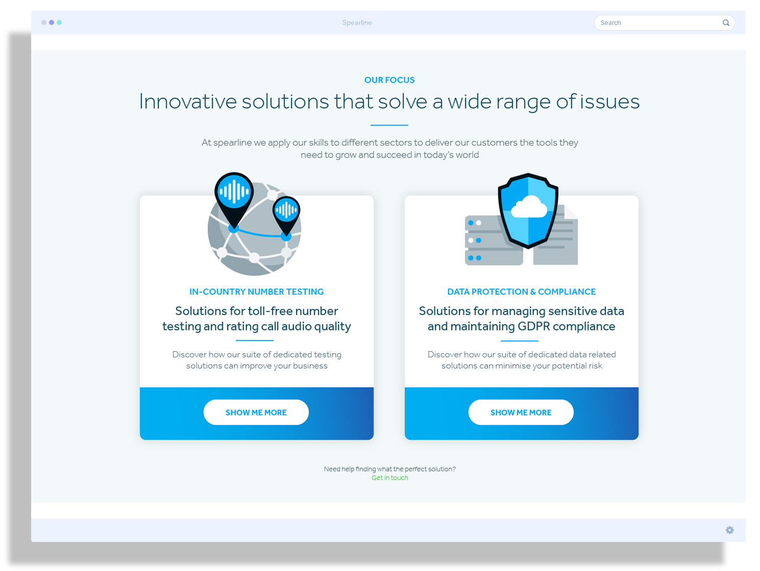
The main aim of this project was to make the site more interactive, engaging, and visually pleasing. Spearline wanted to shorten the journey for new customers to get information as seamlessly as possible about the products relevant to their individual needs.
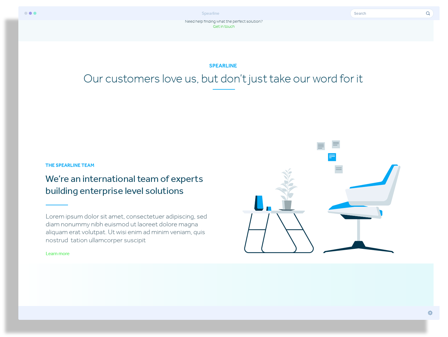
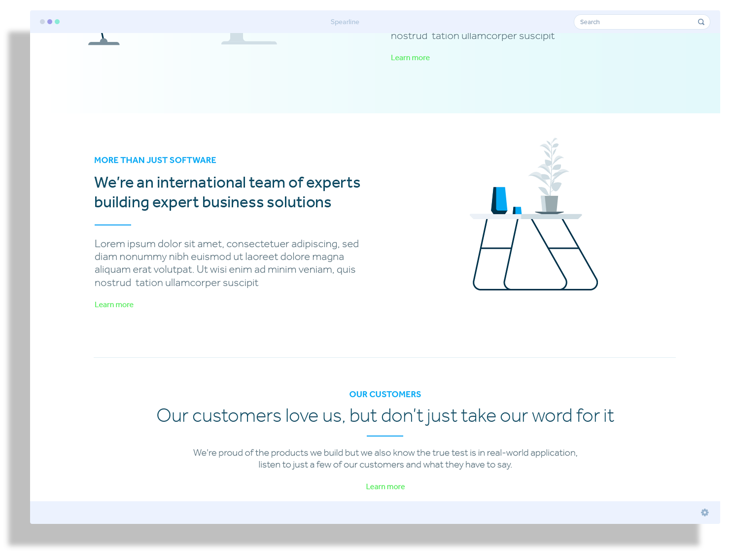
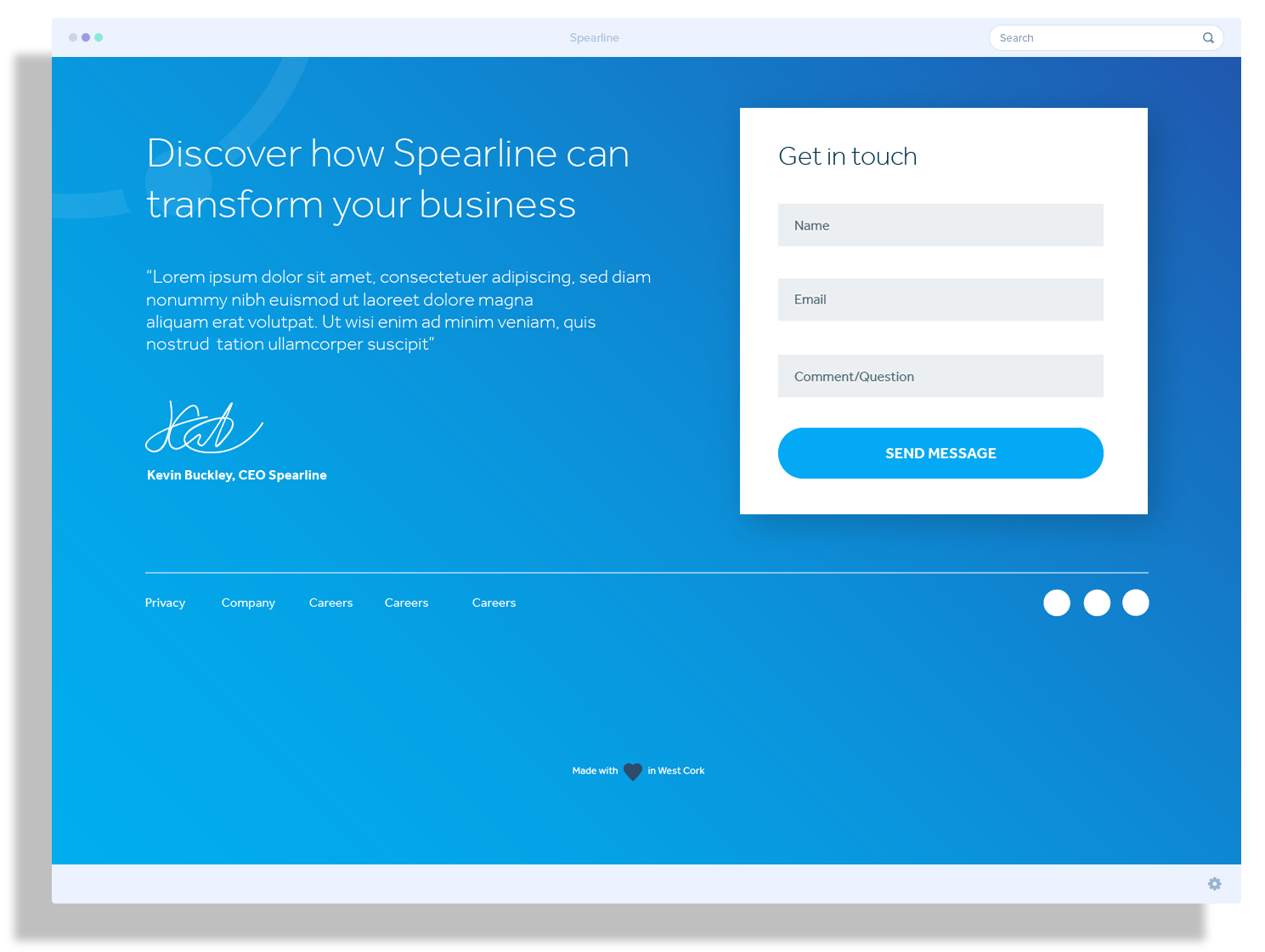
I mocked up a single-page website with new icons and colourful graphics to highlight the products on offer and attempt to give a better user experience and achieve a more contemporary look.

